

"Color Perception and Its Psychological Effects in Play Area Design"
Color is the sensation created when light hits objects and surfaces and is reflected back to our eyes. The person who first studied how color is formed, by passing white light through a prism and using the technique of reflection to separate the colors, is Isaac Newton, a key figure in classical physics during the 18th century.
Colors, created by the energy produced by light, are factors that can influence not only adults but also children, affecting their body functions, minds, and even emotional states. Studies have repeatedly proven that colors contribute to brain development, creativity, productivity, and learning, as well as directly impacting people's emotions.
Research has shown that environmental factors, such as increasing productivity and success, reducing error rates, and triggering positive behaviors, play an important role. It has been observed that children are able to reach their full potential in environments where they are provided learning opportunities. Therefore, it is crucial to seriously consider both color theory and how colors affect mood when selecting the colors for play area components.
Another result of the psychological effects of colors is that calming colors can reduce vandalism, as demonstrated in a field study. Blue lights were installed in some neighborhoods in Glasgow, and a significant decrease in crime rates was observed in these areas.
White represents purity and cleanliness, and it is frequently used in cosmetics and cleaning products.
Black represents power, passion, and mourning in most cultures. Because of its negative effect, combinations with other colors can cause unfavorable stimuli.
Red is one of the most stimulating and dominant colors. It is one of the first colors that children can distinguish. Darker shades of red can have negative effects on energetic children, so mixing them with white or pink tones can create a calming effect.
Yellow is known to bring joy and happiness, while also having a relaxing mental and physical effect. However, when used excessively in a space or product, yellow has been observed to cause anger and tension.
Blue has a calming effect, lowering blood pressure and heart rate. Adding black to blue creates a depressive effect, while mixing it with white has a calming and soothing impact.
Green is often seen as the most relaxing color. Lighter green tones, created with white, represent nature and have been observed to provide mental clarity and reduce stress.
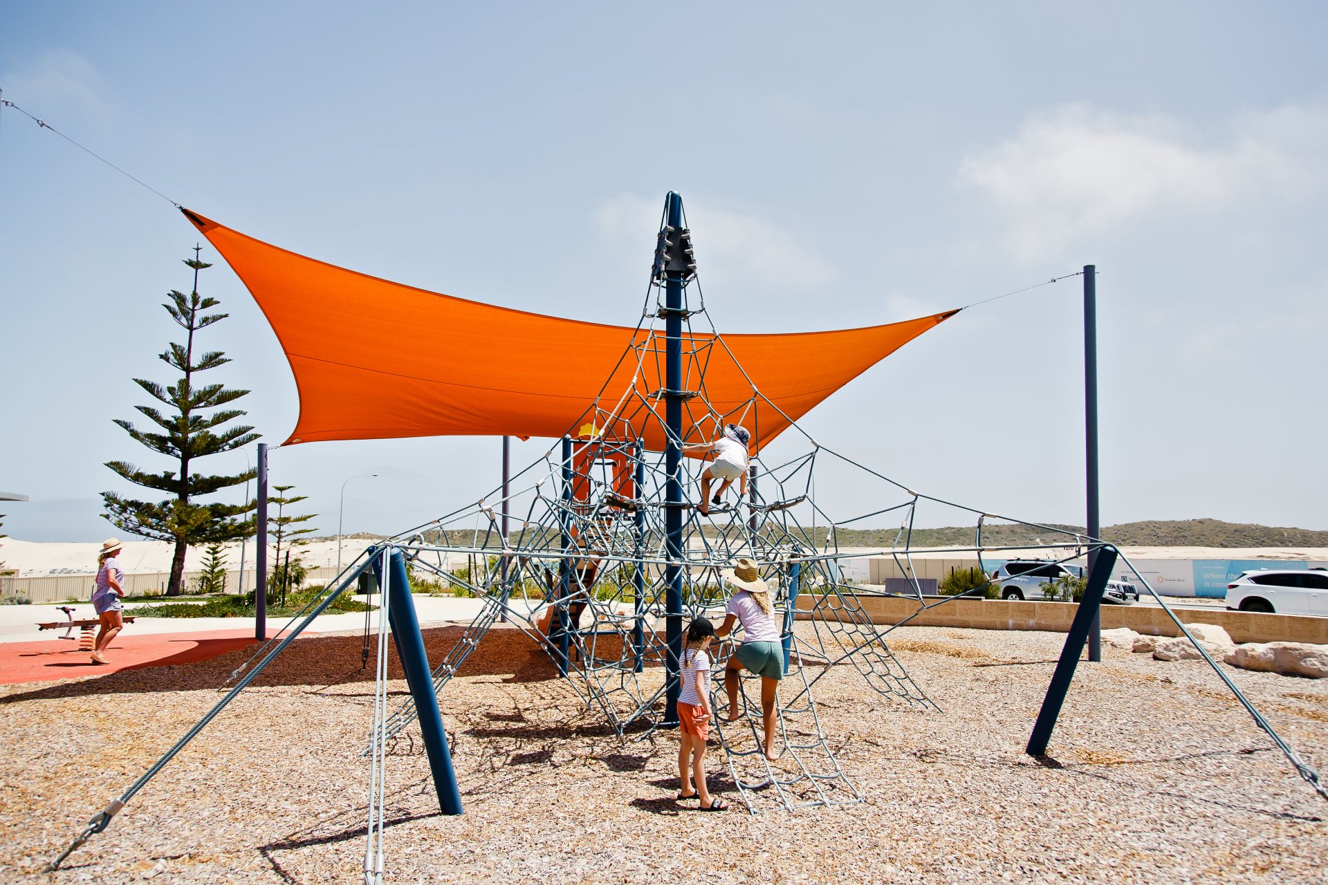
Orange combines the excitement and energy of red with the happiness of yellow. Considered an anti-fatigue color, orange, although not as energetic as red, is a warm color that stimulates energy. However, it is known that environments with intense orange encourage people's socializing instincts, which is why it is often used in playgrounds.
Purple symbolizes nobility, luxury, bourgeoisie, and prestige. It has a melancholic effect. Dark shades of purple can subconsciously trigger fear and sadness, making it a favorite color of people who are close to depression. When mixed with white to create lighter tones, purple is seen to provide physical and mental tranquility and stimulate creativity.
Brown represents the earth and naturalness. However, it is known for its somber effect, making it difficult to stay for long periods in environments designed with brown. For this reason, brown is often used in fast-food restaurants, where high mobility is preferred and where it is important to prevent people from sitting for long periods.
Gray symbolizes humility, balance, and stillness. It can be used as a balancing element in diplomatic and formal environments. However, because it can create a stifling atmosphere, it is not a color commonly preferred. It is better used as a complementary color.
Understanding how colors can create different impressions makes it easier to choose a color scheme, which is primarily based on the color wheel and color harmonies.
The color wheel is a standard infographic that arranges colors according to their wavelengths. This wheel is used to view colors systematically together and understand their relationships more easily.
Briefly, the color wheel was first introduced in 1666 and has since been used by designers to classify and organize various primary colors.
These colors consist of primary colors, secondary colors, and tertiary colors. The wheel also shows which colors are considered "warm" and which are considered "cool." Color harmony, which means the compatibility between colors, is based on the circular diagram of the color wheel and adjusted according to points that are equidistant from each other on the wheel. The opposing alignments on the color wheel create harmonious unity when used together.
Monochromatic Colors
These are made up of light and dark shades of a selected color. When used together, they create a good harmony. Monochromatic harmony in a design can create a clean and elegant feeling, but it may make it difficult to highlight key elements in the design.
Analogous Colors
This harmony is created when colors that are adjacent to each other on the color wheel, such as red and orange, are used together. This creates a calm and peaceful atmosphere in the design.
Complementary Colors
A complementary color is the color located directly opposite the selected color on the color wheel. Complementary colors make each other appear more vivid. While one color is used dominantly, the other is used as an accent to enhance the design.
Triadic (Equilateral Triangle) Colors
This harmony involves using three colors that are equidistant from each other on the color wheel, creating an equilateral triangle. This scheme provides a balanced and vibrant look.
Split-Complementary Colors
This harmony is achieved by choosing a color and its complementary color, along with the two adjacent colors to its complement. Unlike direct complementary colors, this scheme allows for a softer, less risky design.
Tetradic (Rectangle) Colors
In a four-color harmony, a rectangle is formed on the color wheel, and the colors at each corner are selected. Although it is the richest of all harmonies, achieving harmony can be difficult. To maintain balance, it is advisable to select one dominant color and use the others sparingly.
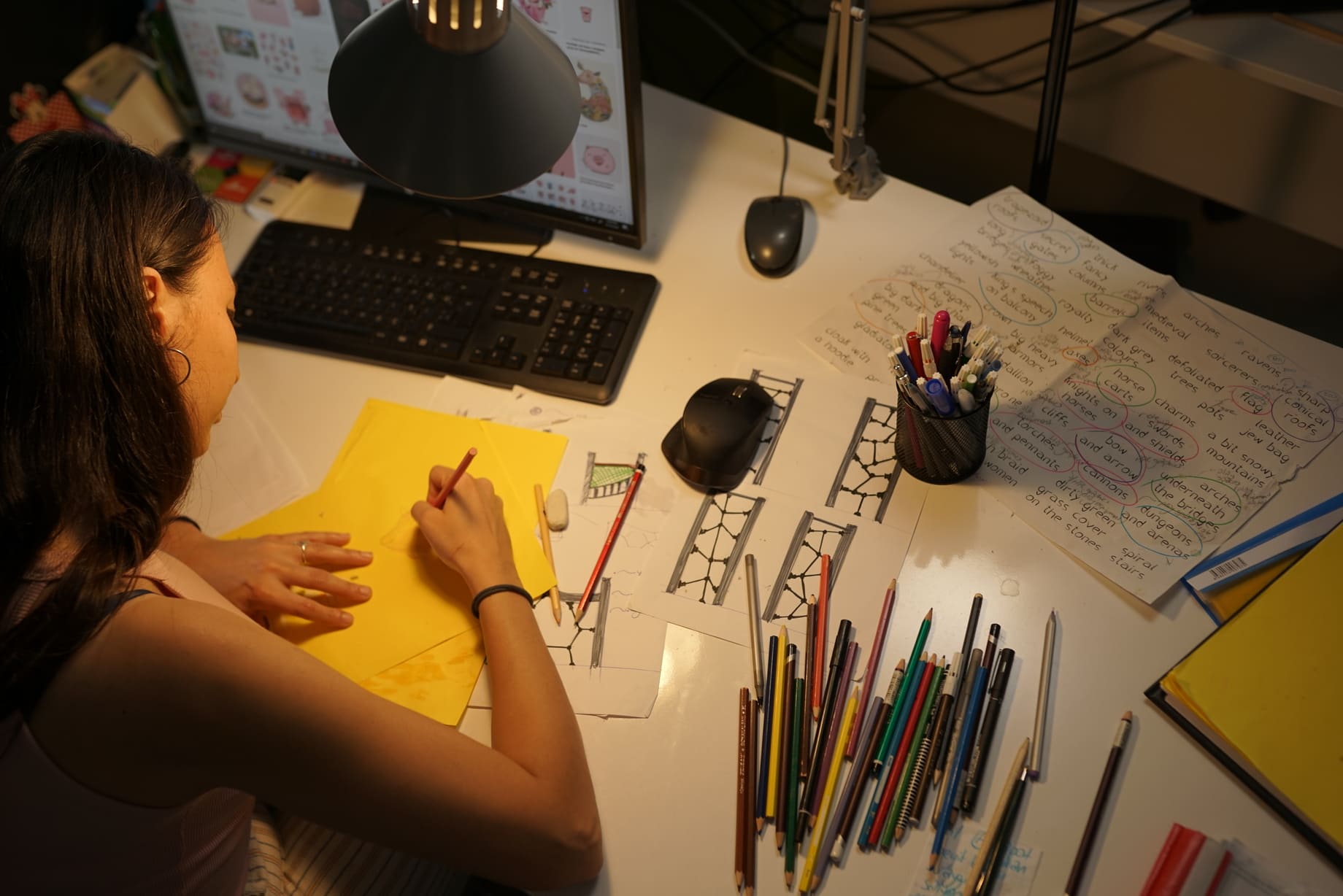
Environmental factors play a significant role in the growth, development, and education of children. Every aspect of their physical environment contributes to this. The color of a room, a product, a brand, or even playground equipment can influence how they are perceived. The design, layout, and color of playgrounds can either contribute to or hinder children's learning and development. Thus, color choice is one of the most important elements in spaces designed for children.
Babies, though undergoing rapid changes in the first six months, cannot distinguish the differences between colors but can recognize contrasts and shapes. Therefore, designing play areas that stimulate their brains and contribute to their learning is very important. Bright, vibrant colors and soft, warm-colored equipment and accessories are suitable for these areas.
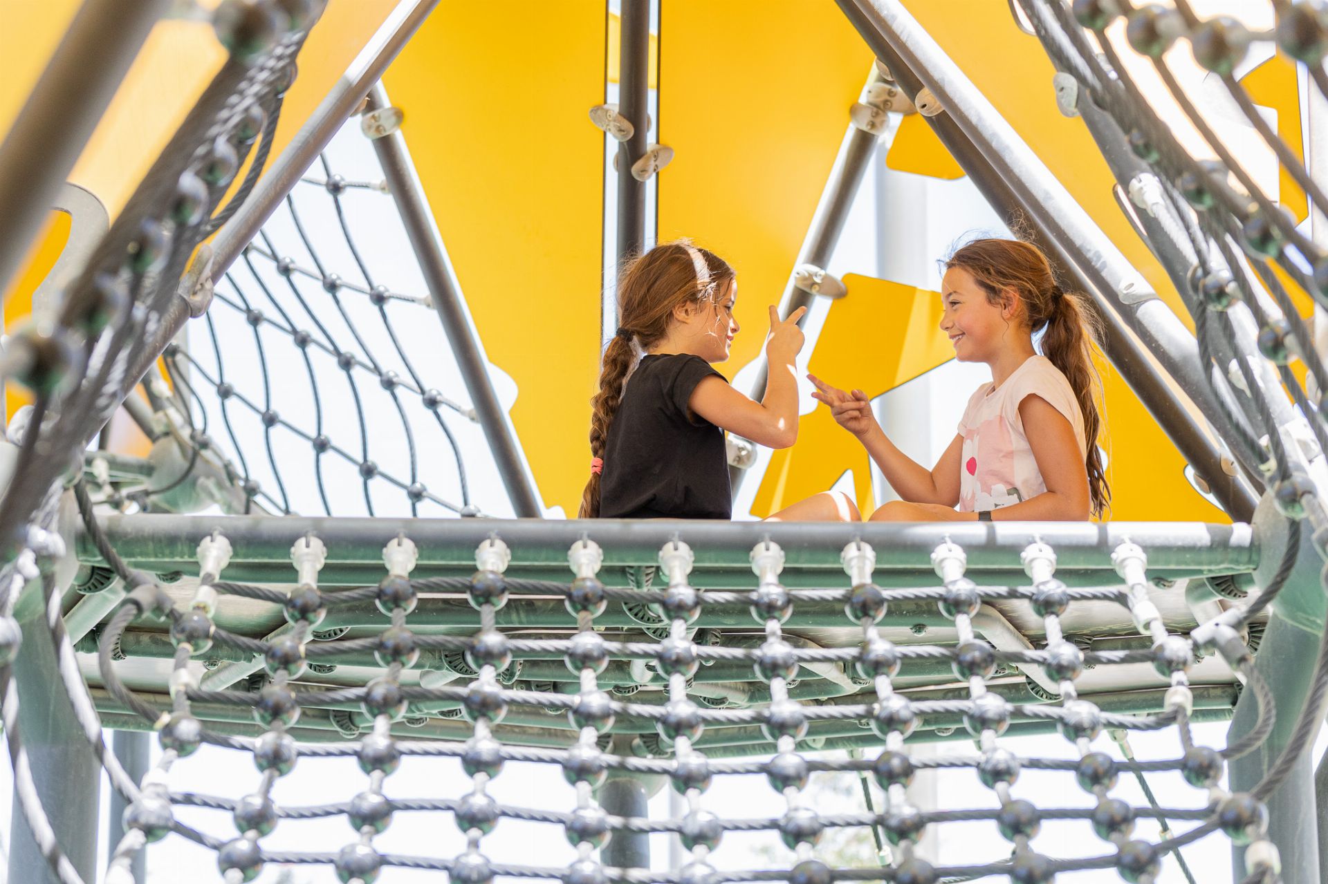
Furthermore, preschool children tend to spend the most time in playgrounds for recreational activities. Therefore, using only vibrant colors can eventually create tension. It is recommended to use pastel shades with vibrant accents as supportive colors. Children's color preferences generally start to form around the age of 3-4. Red, orange, and yellow—warm colors—are typically their favorites. Research on the effects of color on attention, learning, and sleep shows that well-planned environments improve children's learning abilities, increase attention, and provide physical and emotional tranquility.
As mentioned earlier, colors have a direct effect on emotions and feelings, which can vary from person to person. Depending on culture and upbringing, people may have different subconscious associations with colors.
Nevertheless, no child would ever consider a monochromatic (black, gray, white) play area a fun place to play, as these colors are generally associated with "serious" and "professional" feelings. Therefore, it is important to avoid using only dark shades, as this can make the playground look drab, boring, and somber.
However, using too many colors can make a playground appear pale and chaotic. To avoid this, many designers recommend following the 60-30-10 rule for color palettes. For example, choosing a palette consisting of 60% orange, 30% blue, and 10% green is a good approach. Taking all these factors into consideration, selecting a color scheme that stimulates the senses and creates a positive impression in playgrounds is a crucial part of the design process.
References:
- Arş. Gör. Tülay ÖZDEMİR, Criteria Affecting Color Selection in Design
- Arş. Gör. G. Cankız ELİBOL, Arş. Gör. Yılmaz KILIÇ, Doç. Dr. Erol BURDURLU, Material Use in Preschool Children's Toys and Color Preferences of 4-6-Year-Old Children
- Aslı SUNGUR, Patrycja CZAPLINSKA, Designing Playgrounds for All